BRAND BOOK - GUCCI
2020
GUCCI BRAND BOOK
Concept Design & Process
Fashion Project
Year
2020
GUCCI VISUAL BRAND ANALYSIS
Pagination & Planning : Gucci book
2020
GUCCI PRELIMINARY PLANNING PROCESS
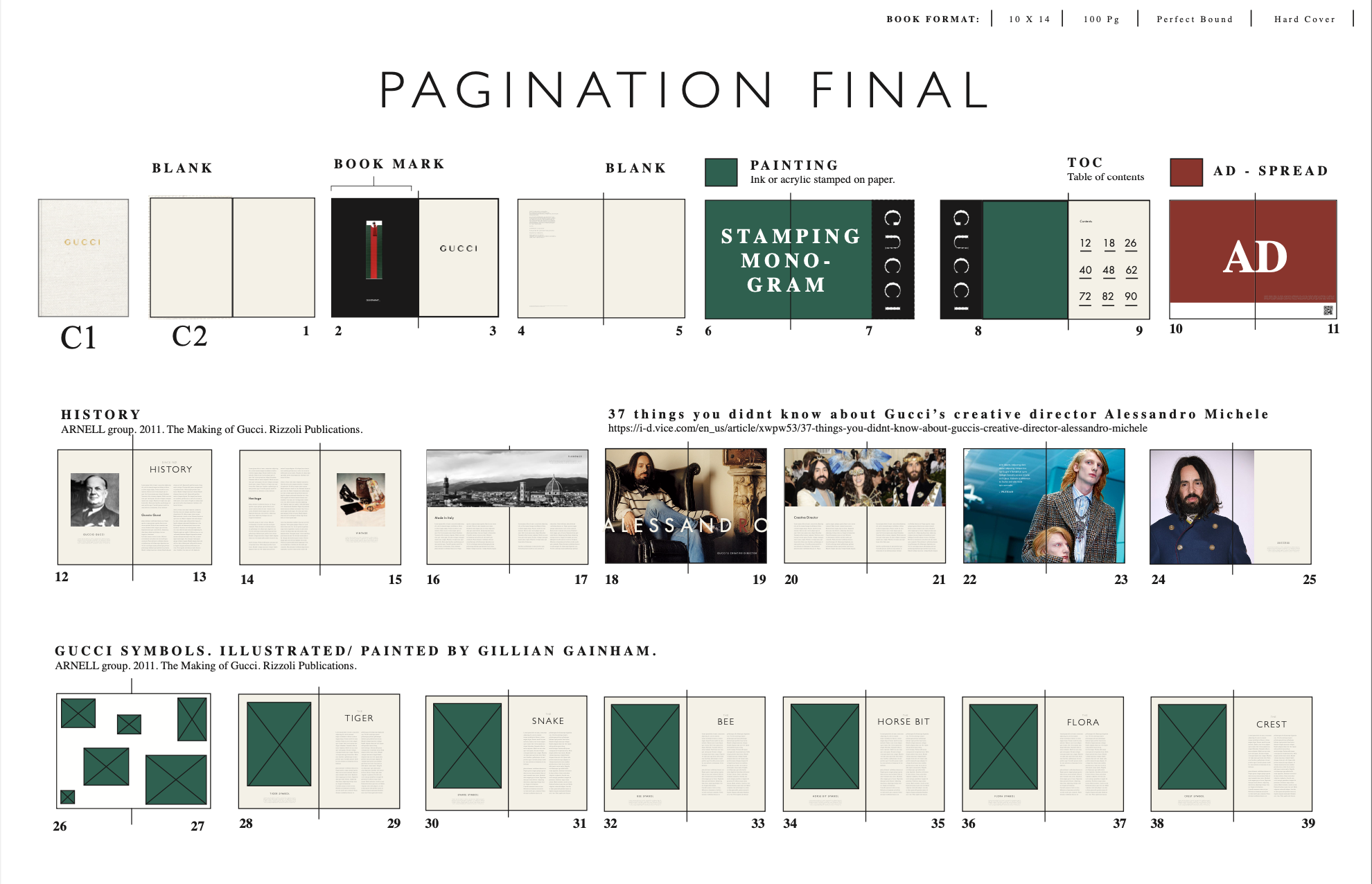
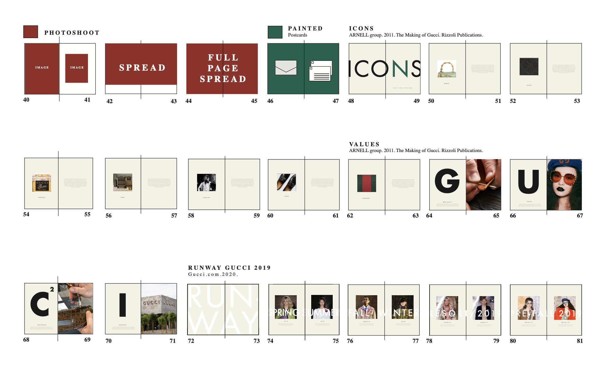
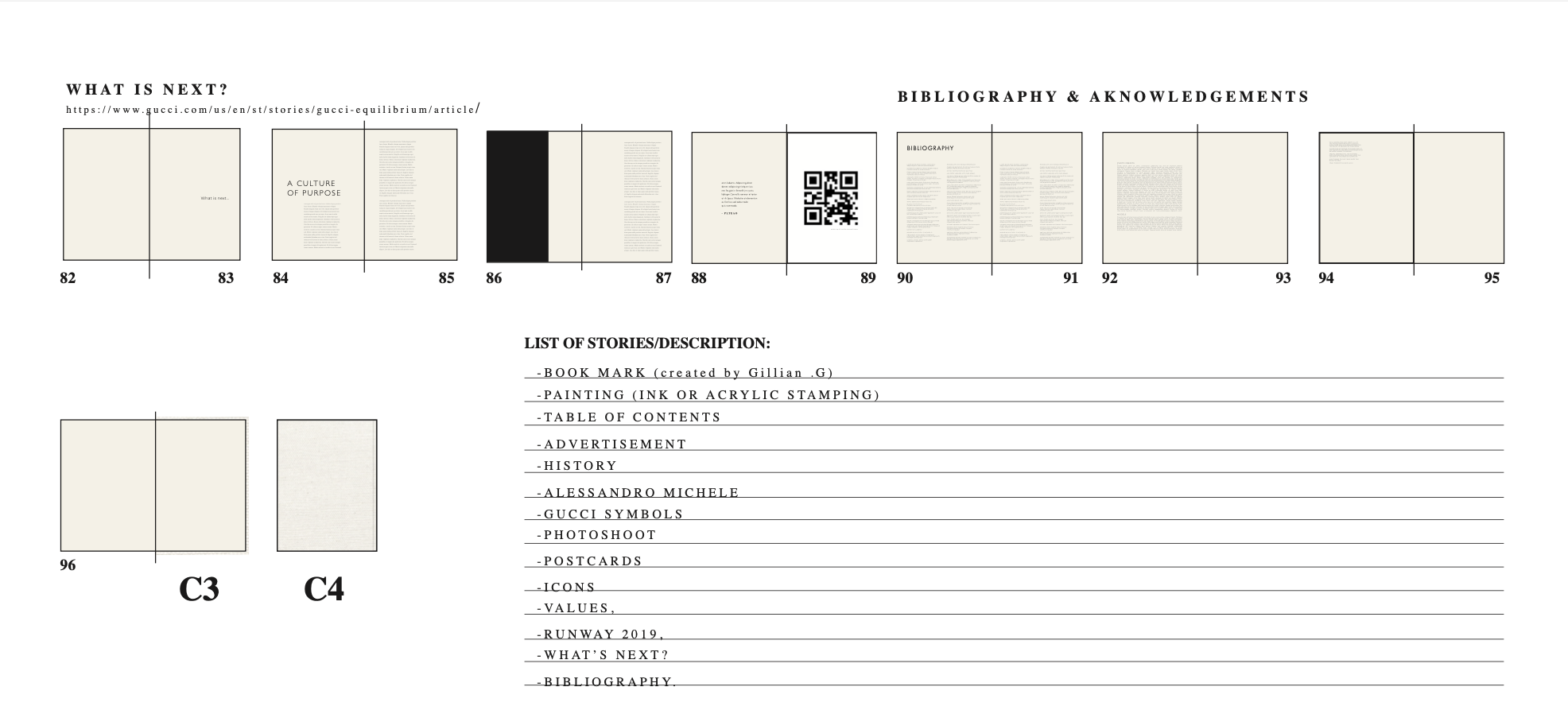
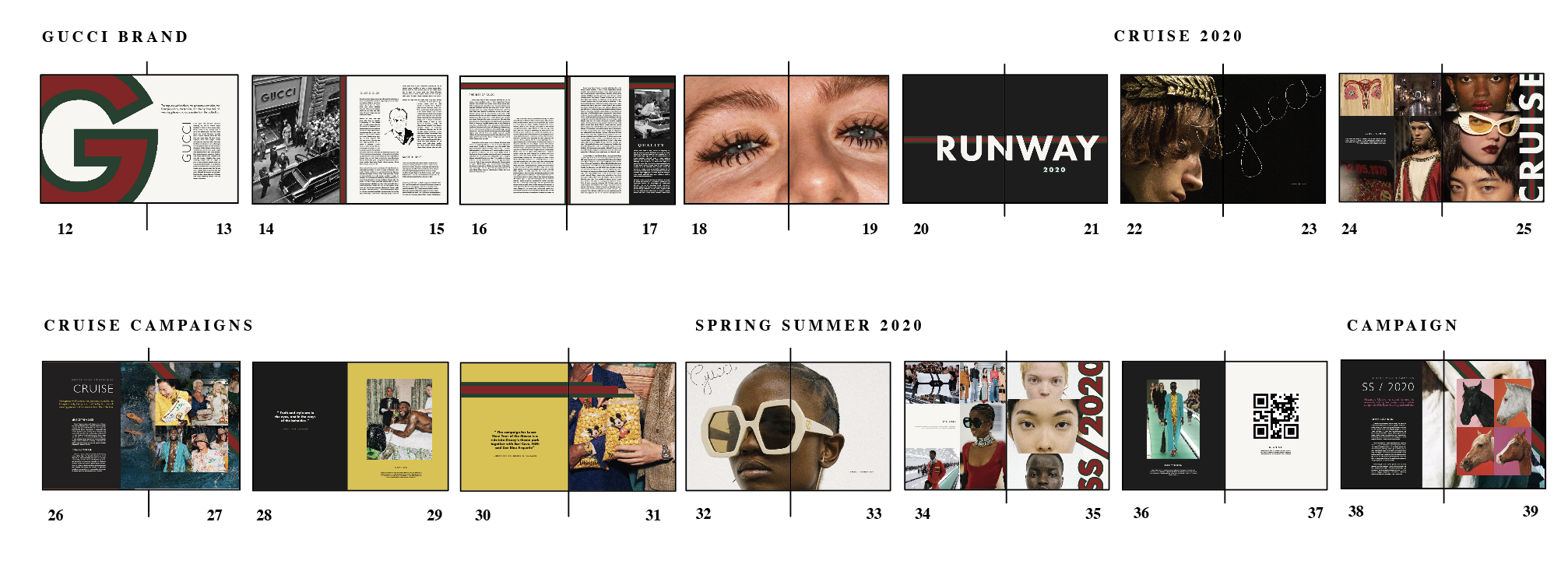

Rationale
Gucci operates within Rambourg’s “accessible core” of luxury, balancing aspiration, status, and global reach. The brand appeals to both affluent and aspirational consumers, particularly younger luxury audiences who are drawn to fashion as a form of identity, self-expression, and cultural participation.
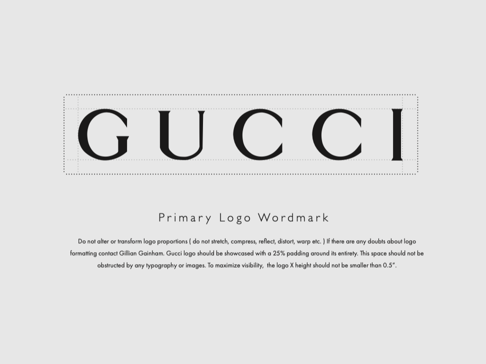
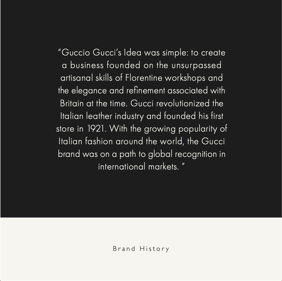
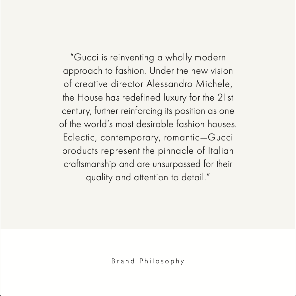
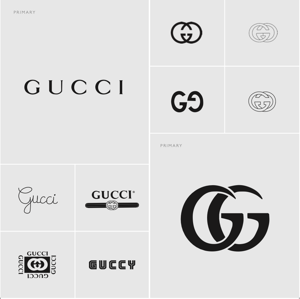
This style book was designed to reflect Gucci’s unique position as a heritage luxury house that continuously reinvents itself. Under Alessandro Michele’s creative direction, Gucci became more eclectic, symbolic, gender-fluid, and visually disruptive. His era reframed the brand as less traditional and more expressive, creating a world defined by fantasy, contradiction, maximalism, and individuality. That spirit informed the overall direction of this book. The goal was not simply to document Gucci’s branding, but to translate the feeling of the brand into a complete editorial experience. Gucci’s strength lies in its ability to create a consistent brand attitude across every touchpoint: product, campaign, retail, digital, packaging, typography, and materiality. This book therefore needed to feel cohesive, immersive, and intentionally designed from cover to final page. The visual identity begins with Gucci’s most recognizable symbols: the word-mark and the double-G monogram. The double-G emblem, originally associated with the House’s heritage, has become synonymous with luxury, craftsmanship, and recognition. For this style book, the primary word-mark and monogram were treated as the core identity assets, while selected secondary marks were included to reflect Gucci’s broader visual vocabulary.
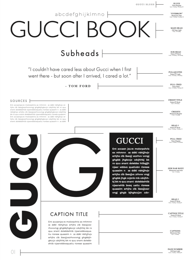
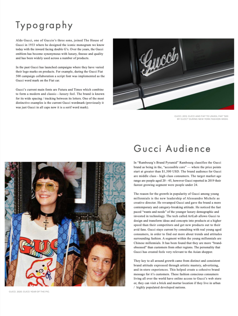
Typography was chosen to balance refinement with visual tension. Gill Sans, set with wide tracking and a lighter weight, creates a sense of restraint, elegance, and clarity. Futura introduces modernity and contrast, while PT Futura is used in larger secondary headings to bring in a bolder, more disruptive energy inspired by Gucci’s contemporary creative direction. Montserrat is used sparingly as a supporting typeface for functional details such as sources, captions, and eyebrow text. Across the 100-page format, variation in scale and hierarchy creates rhythm, prevents visual fatigue, and keeps the reader engaged.
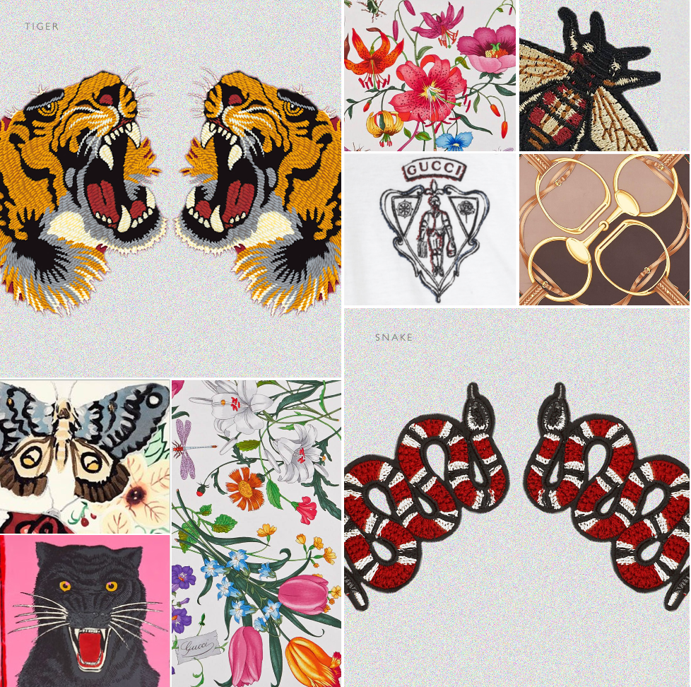
Gucci’s symbolic language was central to the design process. The brand’s motifs; including the bee, butterfly, snake, tiger, panther, flora, crest, and horse bit — are not merely decorative. They contribute to Gucci’s mythology and communicate ideas of beauty, danger, transformation, heritage, exoticism, and fantasy. These symbols deepen the brand world and allow the style book to move beyond surface-level aesthetics into meaning and narrative.
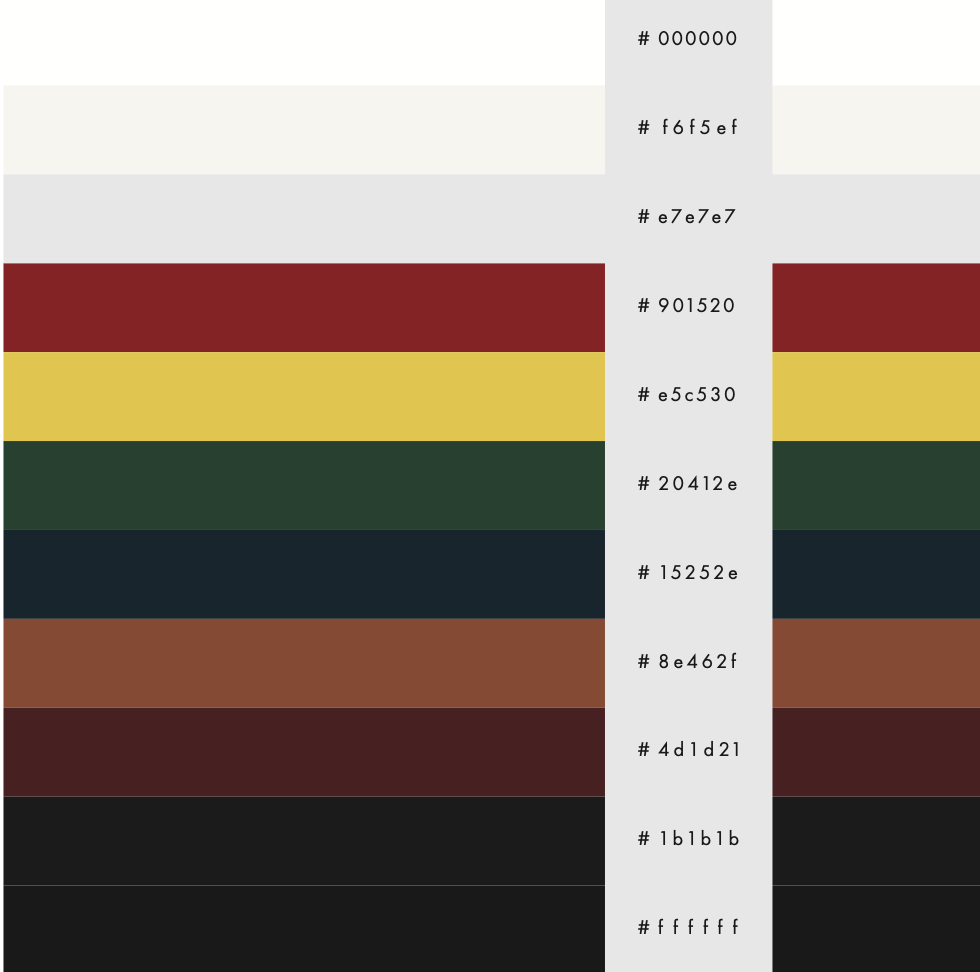
The color palette was drawn from Gucci’s product lines, heritage codes, and digital presence. The iconic red and green tones were color-matched from Gucci’s canvas stripe, one of the brand’s most recognizable visual signatures. Since Gucci often avoids stark pure black and pure white, softer black and white tints were selected to create a more refined tonal system. Additional browns, yellows, and blues were inspired by Gucci’s leather goods, loafers, textiles, and recent collections. Together, the palette creates a balance between heritage, richness, warmth, and modernity.
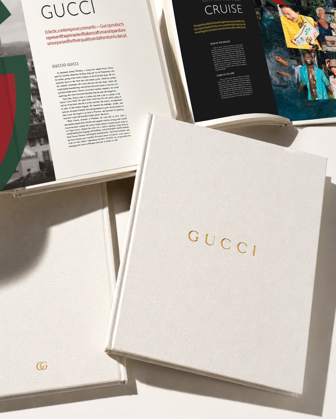
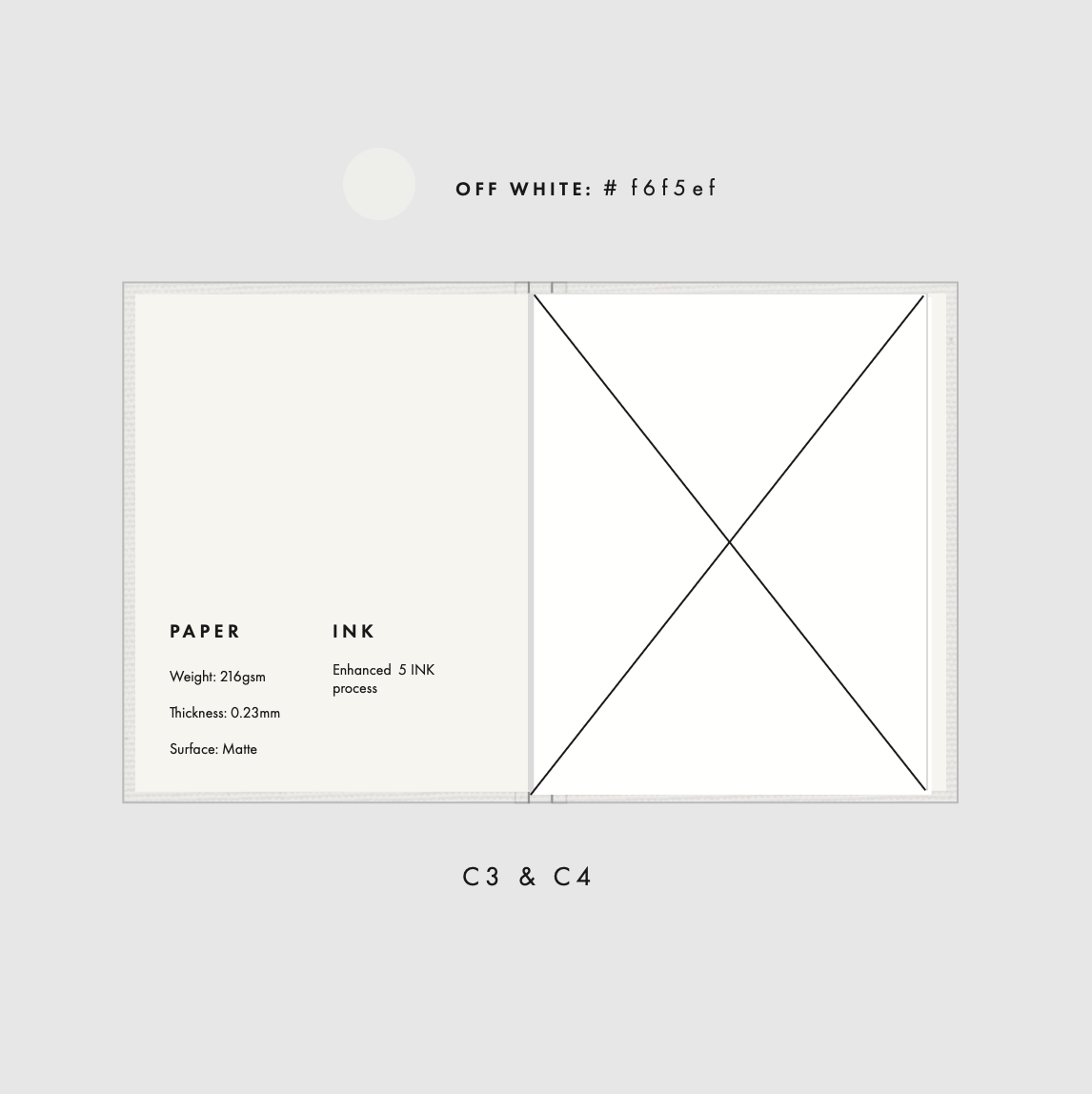
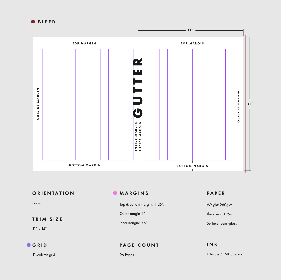
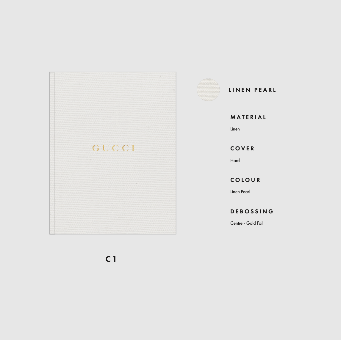
The material and production choices were designed to make the book feel like a luxury object rather than a standard style guide. The premium canvas hardcover, pearl-white cover, gold foil debossing, and photo-paper interior pages were selected to reflect the quality and tactility associated with Gucci itself. The 11 x 14 format gives the book a strong physical presence, allowing it to function as both a reference piece and a display object. Generous margins and negative space create an editorial sense of restraint, allowing the imagery, typography, and written content to breathe.
The content was curated to educate the reader on Gucci’s history, icons, motifs, runway language, and contemporary identity while also creating an emotional experience. Rather than presenting information in a purely instructional way, the book is designed to immerse the reader in Gucci’s visual world. Each section builds a clearer understanding of how the brand uses heritage, symbolism, craft, and provocation to maintain cultural relevance.
Additional imagery is sourced and credited from Gucci’s official materials and The Making of Gucci. Hand-painted elements, ink stamping, and acrylic textures are incorporated to add a tactile, handcrafted quality. These details create contrast against the precision of the editorial layout and make the book feel more exclusive, personal, and collectible.
The overall intent is to design with modernity, sophistication, and controlled drama. The book should feel refined but not sterile, expressive but not chaotic, luxurious but still culturally alive. Its pacing alternates between quiet, spacious moments and bold, visually charged pages to maintain momentum throughout the reading experience. Ultimately, this style book is intended to function as both a brand guide and a luxury object: tactile, symbolic, editorial, and emotionally immersive.